For what it's worth, we've done quite a few tests with WMF fundraising
differences in performance overall. We're now using OOUI styles which have
consistently performed well. I think they strike a nice balance between
with other parts of the site.
Post by Federico Leva (Nemo)Yet it shouldn't be too hard to notice a 20 % slowdown with small
Post by Federico Leva (Nemo)usability tests/focus groups. It could be interesting to test a couple
existing skins and a couple big interface changes in the works (such as
Special:RecentChanges and Special:Search) to see if there is any such big
gap anywhere.
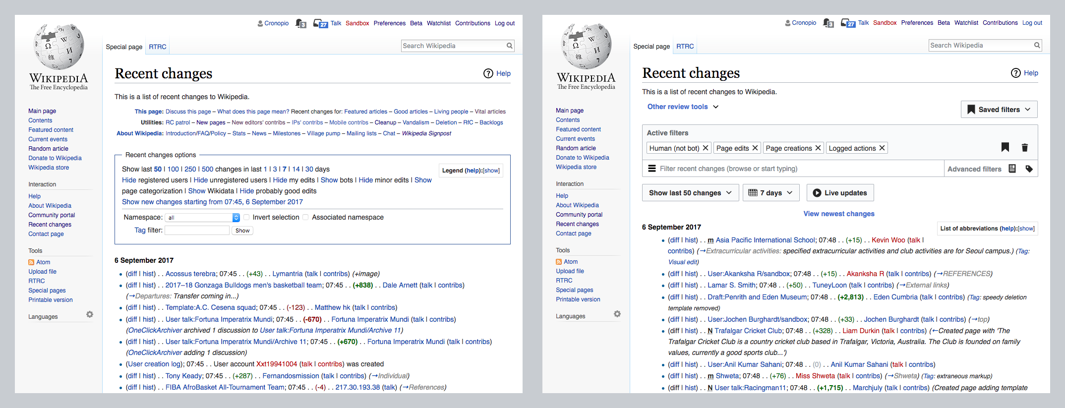
For the case of Recent Changes a before/after comparison
<https://phab.wmfusercontent.org/file/data/keh3ox7d7zowy776azjp/PHID-FILE-xyklxklkb6g7nyu3jmi2/RC-before-after.png> does
not seem to suggest that the changes involved going flat. In the previous
state the filtering UI was a box with a flat lists of links and text, while
the new UI uses contrast and grouping to help users identify the different
elements.
If there is any particular aspect related to flatness that anyone thinks
we need to pay special attention to, feel free to share it and we can
incorporate it in future research. We have been doing different rounds of
research to test initial concepts
<https://commons.wikimedia.org/wiki/File:Editing_-_Recent_Changes_Filters_Rd1_Findings_2016.09-10.pdf>
, iterated ideas
<https://commons.wikimedia.org/wiki/File:Editing_-_RC_Extended_Filters_Usability_Testing_Deck_2017.06.pdf>
and the version available on beta
<https://commons.wikimedia.org/wiki/File:Contributors_-_RC_Filters_Integrated_%2B_Beta_Satisfaction_testing_deck_2017.07.pdf>.
The results suggest that users are able to identify more clearly which is
the current state of the filters and how to manipulate them with the new
approach.
In general, I think that labels such as "flat design" combine several
different aspects that makes it hard to make broad statements like flat
design being good or bad for all contexts. Talking about the impact on
choices for the clarity of affordances, contrast of elements, layout
approaches, etc. makes more sense to me. For example, the Nielsen/Norman
article
<https://www.nngroup.com/articles/flat-design/?lm=flat-design-best-practices&pt=article>
criticizes both skeumorphism (for resulting in "clunky interfaces") and
flat design (for the loss of clickability signifiers), but recommends what
they call "flat design 2.0" for incorporating signifiers based on our
Early pseudo-3D GUIs and Steve-Jobs-esque skeuomorphism often produced
Post by Federico Leva (Nemo)heavy, clunky interfaces. Scaling back from those excesses is good for
usability. But removing visual distinctions to produce fully flat designs
with no signifiers can be an equally bad extreme. Flat 2.0 provides an
opportunity for compromise â visual simplicity without sacrificing
signifiers.
In all fairness, I hope we wouldnât. OOUI has so much more elements that
have no alternative in Apex theme, even accessible checkboxes are not
present in Apex (see https://phabricator.wikimedia.org/T162849).
Retiring Apex, not reinstating it, seems like the best solution at this
point, since Wikimedia developers and designers have a pretty average track
record when it comes to consistent development of alternative solutions (e.
g., current skins).
The research itself is a bit misleading and sensationalising: it doesnât
compare stylistic elements of flat design and skeuomorphism, it essentially
compares bad design practices (bad styling of CTA/primary button, styling
tabs like some kind of buttons, styling links like text) and good
practices. It should not be taken at word, although usually Nielsen Norman
Group have good points in their studies.
Post by Bartosz DziewoÅskiOOUI was originally created with a classic design for buttons and other
fields, and that theme (now called 'Apex') is still available and
maintained. https://doc.wikimedia.org/oojs-ui/master/demos/?theme=apex
We could switch to it at a moment's notice. Personally I wouldn't mind
seeing it again ;)
Still, buttons in the default theme are not entirely "flat", they have
at least borders (or strong backgrounds) to distinguish them. The biggest
problem is the existence of 'frameless' buttons (in both themes), which
look just like normal text if they don't have an icon or something.
_______________________________________________
Design mailing list
https://lists.wikimedia.org/mailman/listinfo/design
--
Pau Giner
Senior User Experience Designer
Wikimedia Foundation
_______________________________________________
Design mailing list
https://lists.wikimedia.org/mailman/listinfo/design