quiddity
2014-12-20 22:20:57 UTC
(I've CC'd the design-list, for all of these ideas. Design: please see the
earlier part of this thread (7 msgs) for more context, at
https://lists.wikimedia.org/pipermail/wikitech-l/2014-December/079793.html)
harmful, and should be avoided as much as possible. It increases the
effort required to see content, and thereby reduces the likelihood of any
given section being seen. This is bad for readers (harder to access
knowledge), and bad for editors/potential-editors (harder to spot
errors/vandalism during casual reading). It goes for article content as
well as navigational elements and metadata. Footer-navboxes are frequently
collapsed, and I think this has established a harmful precedent. (See also
[[Linus's Law]], "given enough eyeballs, all bugs are shallow". We need
more eyeballs, not less.)
Re: ToC improvements - Agreed. As always, the difficulty is with fitting it
in somewhere, given the diversity of screen/browser-window sizes that each
user has or prefers. It would be especially useful on long articles, but it
would also take up the most space there. I'm not sure where the most recent
brainstorming and notes are, regarding the standard mediawiki sidebar? I
know it's been discussed a *lot* over the years...
Re: "birds eye view" - I really like this idea, taken to the 'completism'
level...
A number of text/code editors, have a "minimap" attached to the side.
Loading Image...
Loading Image...
Loading Image...
It works as an enhanced-scrollbar, and as an overview, and it shows
text-selections from ctrl-F.
I think something similar to this would potentially help us:
* To better understand the scope of an article/section/entry, upon first
loading the page.
* As editors, to find & refine wall-of-text paragraphs.
* Encourage light-readers to scroll more, particularly if they see
thumbnails of images - in the same way that good textbooks can use images
as content-hooks.
* more?
It would need Increased font size for headings, to enable ToC-like
functionality. And some sort of minimal-version, for users who find
animated-aspects too distracting. What else?
It might be too complicated to be a global default (UX-wise, and/or
Performance-wise), but I'd love to see something like this as an option
(toggle or preference or gadget).
HTH. --Quiddity
earlier part of this thread (7 msgs) for more context, at
https://lists.wikimedia.org/pipermail/wikitech-l/2014-December/079793.html)
I'm not sure we should implement collapsible sections for desktop.
If built and instrumented, one may find that users use it a fair bit and
it may be better-than-nothing as solution for certain use cases. But I
don't think collapsible sections would be an adequate feature for those use
cases.
Our table of contents is in desperate need of improvement. Having that be
more accessible throughout the reading experience would be a big step
forward[1] (much like the Wikipedia iOS app). Having a proper TOC means
users don't have to collapse/expand anything.
This would allow users to have a birds eye view of the document at all
times, jump to any section at any time, whilst still being able to scroll
through the document top to bottom as one would expect.
From a performance viewpoint (as opposed to usability) we can still do
optimisations such as not loading images until a section is accessed
(lazy-load).
-- Krinkle
* http://underscorejs.org/
* Wikipedia iOS App: Loading Image...
* User manual: http://asciidoctor.org/docs/user-manual/
Re: Collapsible - I strongly agree that collapsing content is potentiallyIf built and instrumented, one may find that users use it a fair bit and
it may be better-than-nothing as solution for certain use cases. But I
don't think collapsible sections would be an adequate feature for those use
cases.
Our table of contents is in desperate need of improvement. Having that be
more accessible throughout the reading experience would be a big step
forward[1] (much like the Wikipedia iOS app). Having a proper TOC means
users don't have to collapse/expand anything.
This would allow users to have a birds eye view of the document at all
times, jump to any section at any time, whilst still being able to scroll
through the document top to bottom as one would expect.
From a performance viewpoint (as opposed to usability) we can still do
optimisations such as not loading images until a section is accessed
(lazy-load).
-- Krinkle
* http://underscorejs.org/
* Wikipedia iOS App: Loading Image...

* User manual: http://asciidoctor.org/docs/user-manual/
harmful, and should be avoided as much as possible. It increases the
effort required to see content, and thereby reduces the likelihood of any
given section being seen. This is bad for readers (harder to access
knowledge), and bad for editors/potential-editors (harder to spot
errors/vandalism during casual reading). It goes for article content as
well as navigational elements and metadata. Footer-navboxes are frequently
collapsed, and I think this has established a harmful precedent. (See also
[[Linus's Law]], "given enough eyeballs, all bugs are shallow". We need
more eyeballs, not less.)
Re: ToC improvements - Agreed. As always, the difficulty is with fitting it
in somewhere, given the diversity of screen/browser-window sizes that each
user has or prefers. It would be especially useful on long articles, but it
would also take up the most space there. I'm not sure where the most recent
brainstorming and notes are, regarding the standard mediawiki sidebar? I
know it's been discussed a *lot* over the years...
Re: "birds eye view" - I really like this idea, taken to the 'completism'
level...
A number of text/code editors, have a "minimap" attached to the side.
Loading Image...
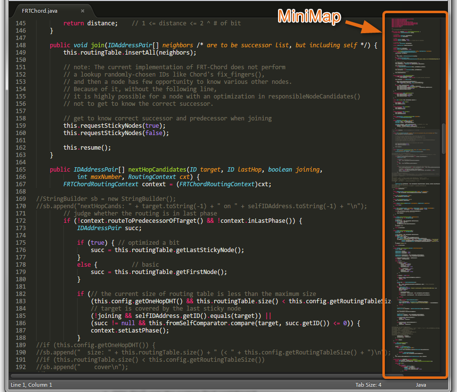
Loading Image...

Loading Image...

It works as an enhanced-scrollbar, and as an overview, and it shows
text-selections from ctrl-F.
I think something similar to this would potentially help us:
* To better understand the scope of an article/section/entry, upon first
loading the page.
* As editors, to find & refine wall-of-text paragraphs.
* Encourage light-readers to scroll more, particularly if they see
thumbnails of images - in the same way that good textbooks can use images
as content-hooks.
* more?
It would need Increased font size for headings, to enable ToC-like
functionality. And some sort of minimal-version, for users who find
animated-aspects too distracting. What else?
It might be too complicated to be a global default (UX-wise, and/or
Performance-wise), but I'd love to see something like this as an option
(toggle or preference or gadget).
HTH. --Quiddity

